Web Pages
Reimagine the MyOptum landing page to brand and improve user experience
Overview
Optum wanted a redesign of the MyOptum desktop product to be more cohesive with other products and provide a better user experience. I researched landing pages from existing Optum products for inspiration and branding alignement. After reviewing the current design, I identified some improvements to design and user experience while meeting company requirements.
Project information
- Collaborators: UX Director, Sr Product Designer
- Client: Optum
- Tools: Figma
- Role: Layout design, research, mockups, team collaboration
- Redesigned the Optum hero experience to better align with the broader Optum product ecosystem, replacing the top navigation with a fully branded nav and introducing a cohesive branded sign-in to strengthen trust and visual consistency.
- To improve usability and scannability, I transformed dense introductory copy into modular content cards, allowing users to absorb key information faster and with less cognitive effort.
- Dynamic elements such as the Health Library were intentionally preserved to maintain system integrity, while optional content areas were structured for easy swapping to support future needs.
- Optional content that could be switched out for something different.
- The update concluded with a fully branded footer, creating a more polished, unified end-to-end experience that elevated both clarity and brand cohesion.
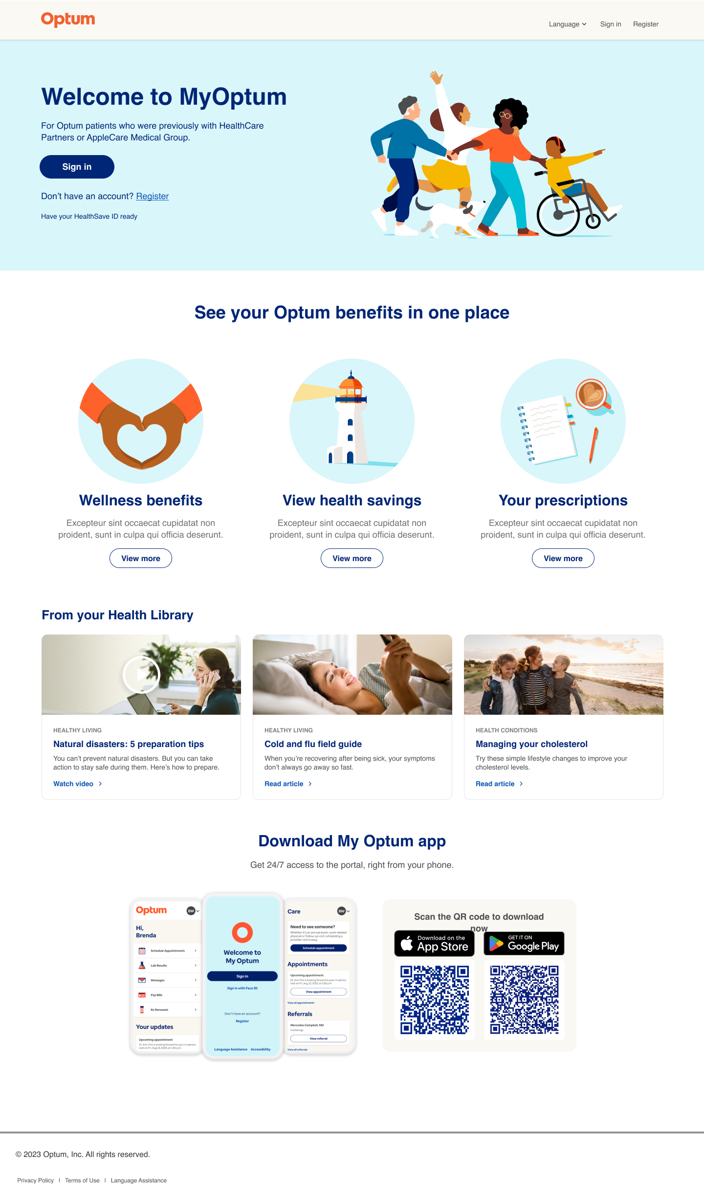
My Optum redesign
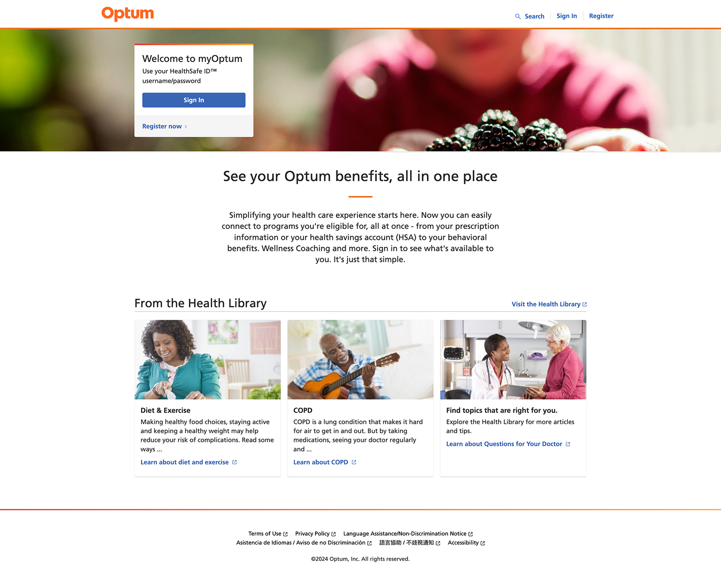
My Optum original
Website redesign ideas for Blue Sky+ to improve audience engagement
Overview
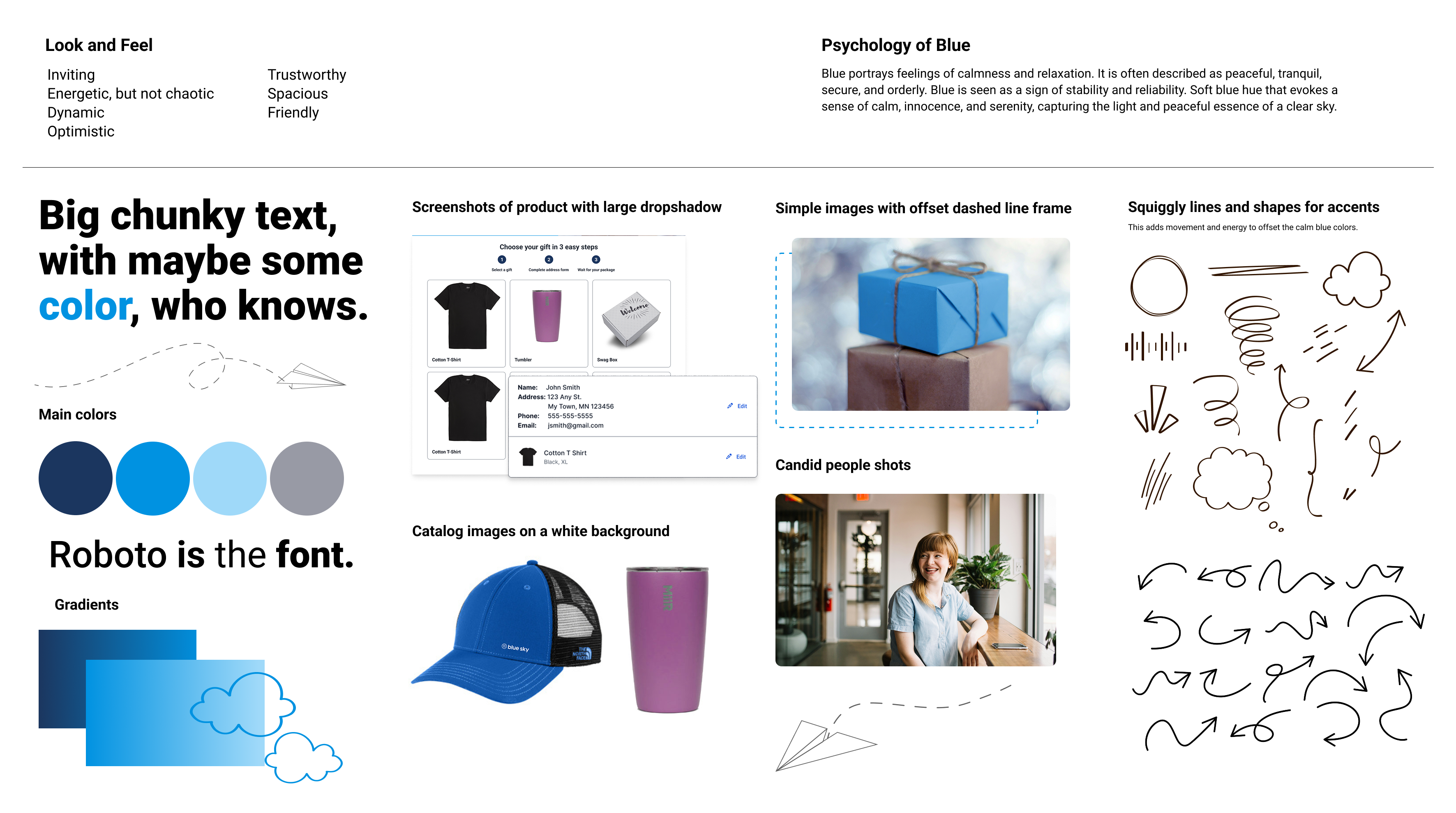
I met with the team to discuss their brand's desired look and feel. They wanted a brighter, friendlier design to attract users, preferring a lighter blue over their darker brand blue. After reviewing their current site and researching successful competitors, I created some mockup ideas.
Project information
- Collaborators: Lead FED, CEO, Marketing Director
- Client: Blue Sky Marketing
- Tools: Figma, Photoshop
- Role: Competitive research, collaboration, layout design, build mockups, moodboard creation, design consulting
Goals and Restraints
- Update with current branding.
- Re-establish look and feel to something more energetic and positive.
- Keep most of the content the same.
- Stay within the current format as much as possible to minimize development time.
- Attract user engagement.
- Define a simpler aesthetic.
The Solution
Upon consulting with the team and reviewing design iterations, several improvements were made.
- The addition of a sky-blue palette brought the site closer to the brand's identity and gave it a brighter and lighter feel.
- The inclusion of icons on the offer cards added more visual distinction to the space.
- Video remained but was repositioned to occupy the space more effectively.
- The form field was moved to the bottom, aligning with the standard placement of forms.
- A more standardized footer was put in place.
- An overall clean and cheerful look was created to attract users to engage with the website.
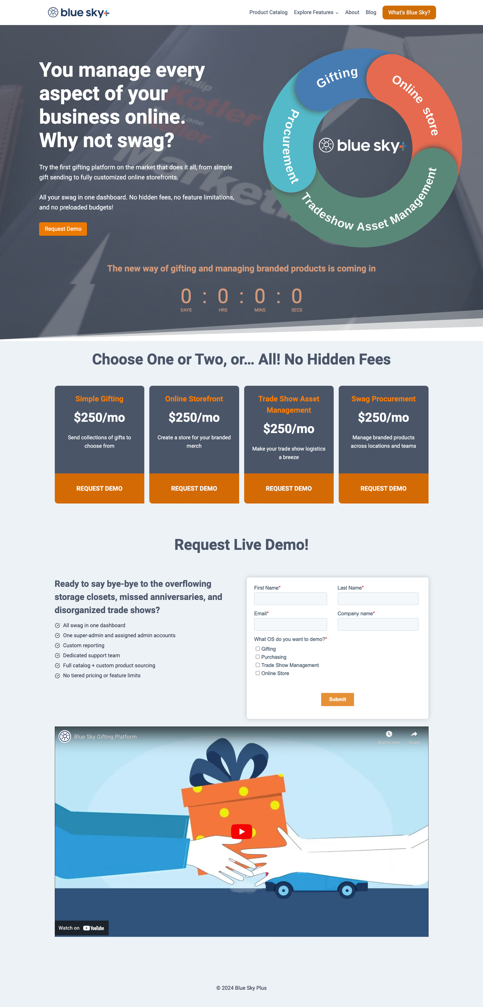
Blue Sky+ original homepage.
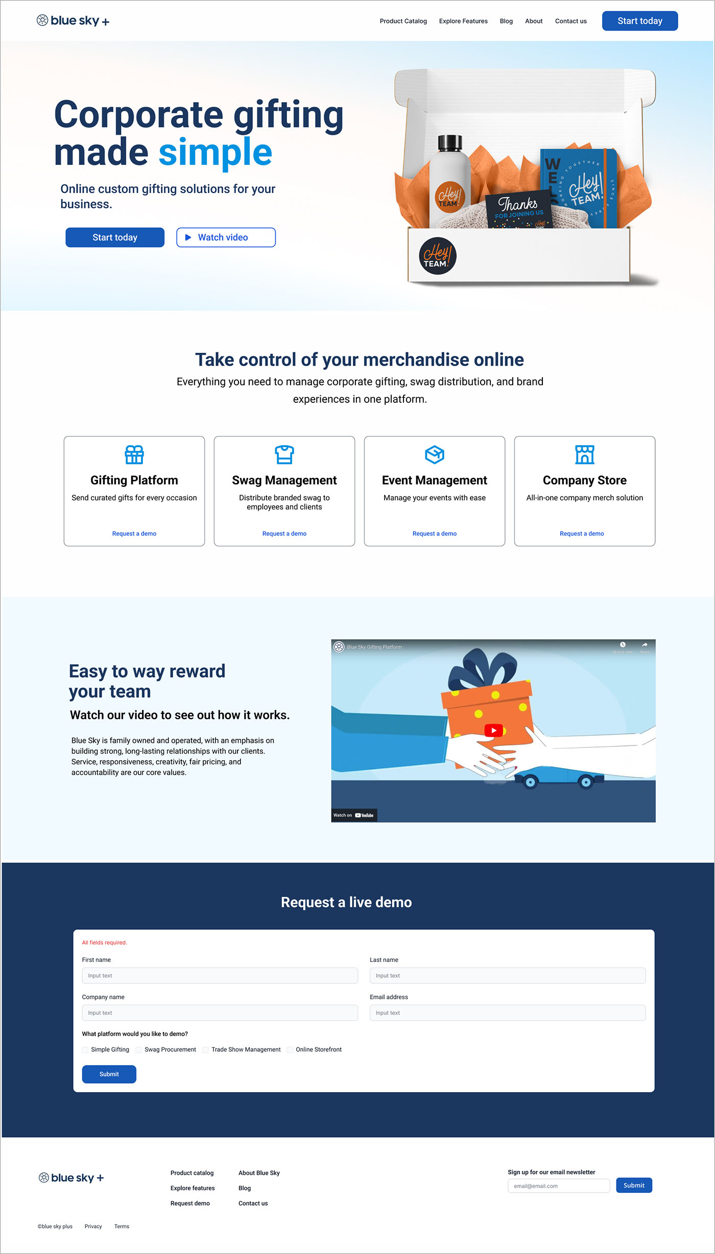
Blue Sky+ redesign homepage.
Redesign moodboard
Homepage design experience for agriculture website designed to increase conversion rates
Overview
The goal is to craft a visually cohesive homepage that aligns with the client’s brand identity and strategic requirements using creative discretion to deliver a user experience that transforms visitors into loyal customers. A component library and sample brand colors were supplied as a starting point.
- Customized a curated set of Figma components to improve brand appearance and meet requirements from creative brief.
- Upscaled, cropped, and supplemented assets to enhance the aesthetic.
- Provided design choices that reflect the client’s stated preferences and professional standards.
- Edited the copy provided using AI programs to create impactful messaging that fits the design.
- Create clear calls to action that drive conversions.
- Used Gemini AI to edit images, create new on-brand images, give suggestions on high-conversion copy and cta text and also produced a custom set of icons that met brand and design expectations.
Project information
- Collaborators: Product Leads
- Client: Decatur Tree Services
- Tools: Figma, Photoshop, Gemini AI
- Role: Interface design, industry research, mockups, component customization, copy editing, content discretion, brand finalization
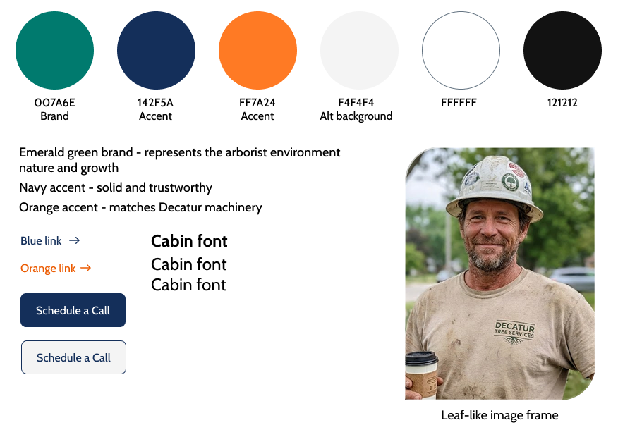
Brand styles